
"Color and Mood: Exploring the Emotional Power of Shades"
 |
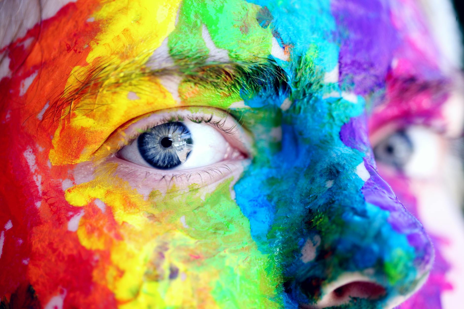
| "Vibrant hues that energize." |
It wasn’t until I went through a particularly stressful phase in life that I truly grasped the deep influence colors have on our mental well-being. As I delved into the world of color psychology and its practical uses, I uncovered remarkable insights about how various shades can impact our emotions, boost productivity, and even aid in healing.Join me on this journey to uncover the intriguing link between colors and emotions. Together, we’ll explore the basic psychology behind different hues and learn how to harness their power to enhance mental health. Along the way, I’ll share personal stories and research-backed tips to help you use color to bring emotional harmony into your life.
 |
| "A splash of color, a touch of creativity." |
The Psychology of Color
How Colors Affect Human Emotions
Through extensive research and personal experience, I’ve come to understand just how deeply colors influence our emotions. Warm tones like red and orange often spark feelings of energy and passion, while cooler shades like blue and green bring a sense of calm and relaxation. Here's my take on the emotional connections tied to primary colors:
| Color | Primary Emotional Response | Secondary Effects |
|---|---|---|
| Red | Excitement, Passion | Hunger, Urgency |
| Blue | Calmness, Trust | Focus, Stability |
| Green | Balance, Growth | Harmony, Peace |
| Yellow | Joy, Optimism | Energy, Clarity |
Cultural Differences in Color Perception
In my studies, I've found that color perception varies significantly across cultures. Here are key differences I've observed:
- Western cultures often associate white with purity and weddings
- Eastern cultures traditionally use white for mourning
- Red symbolizes luck in Chinese culture but danger in Western societies
- Purple represents royalty in European traditions but spirituality in Thai culture
Color Symbolism Across Societies
I've noticed that certain color symbols transcend cultural boundaries while others are deeply rooted in specific traditions. My research shows that natural associations tend to be universal:
- Blue: Often connected to sky and water across most cultures
- Green: Commonly associated with nature and growth
- Black: Frequently linked to power or formality
- Gold: Universally recognized as a symbol of wealth and prosperity
With these psychological foundations in mind, let's explore how these colors manifest in different environments and spaces.
 |
| "Vibrant energy in every stroke of color." |
Colors in Different Environments
Workplace Color Schemes for Productivity
As a color consultant, I’ve observed firsthand how workplace colors can greatly influence productivity. For boosting focus and mental clarity, I consistently recommend blue—it’s a game-changer. Here’s my tried-and-true color strategy tailored for different workspaces:
- Conference rooms: Green (promotes balance and decision-making)
- Creative spaces: Yellow (stimulates innovation)
- Break rooms: Orange (encourages social interaction)
- Individual offices: Blue (increases productivity)
Home Decor and Mood Enhancement
I've discovered that home color choices can dramatically affect daily mood. My top recommendations include:
| Room | Color | Psychological Effect |
|---|---|---|
| Bedroom | Lavender | Promotes restful sleep |
| Kitchen | Yellow | Increases appetite and energy |
| Living Room | Green | Creates harmony and relaxation |
| Study | Blue | Enhances concentration |
Retail Spaces and Consumer Behavior
In my experience with retail design, I’ve noticed how colors play a powerful role in influencing purchasing decisions. For example, red sparks urgency, which is why it’s my go-to for sale signs. On the other hand, black exudes luxury and sophistication, making it an ideal choice for upscale boutiques.
Healthcare Facilities and Healing Colors
When I design for healthcare spaces, I prioritize healing colors:
- Soft blues: Reduce blood pressure
- Gentle greens: Alleviate stress
- Warm beiges: Create comfort
- Subtle yellows: Promote optimism
In lighting and workspace design, I've observed how natural light enhances the effects of colors, helping create the perfect environment for recovery. Now that we’ve explored the impact of color in our surroundings, let’s dive into how we can use colors to maintain emotional balance in our everyday lives.
 |
| "Embracing nature’s peace and tranquility." |
Using Color for Emotional Balance
Calming Colors for Stress Reduction
In my experience working with color psychology, I've found that certain hues consistently help reduce stress levels. I particularly recommend these calming colors:
- Soft Blue: I use this to create a sense of tranquility
- Sage Green: My go-to choice for natural relaxation
- Lavender: I find this perfect for gentle emotional healing
- Pale Pink: I suggest this for nurturing energy
Energizing Hues for Motivation
When I need to boost energy and motivation, I turn to these dynamic colors:
| Color | Effect I've Observed |
|---|---|
| Yellow | Increases mental clarity |
| Orange | Boosts creativity |
| Bright Red | Enhances physical energy |
| Emerald Green | Improves focus |
Color Combinations for Harmony
I've discovered that combining colors strategically creates the most balanced environments. My favorite harmonious combinations include:
- Blue and beige: I use this duo to create a peaceful workspace
- Green and white: I recommend this pairing for refreshing energy
- Purple and gray: I find this combination perfect for meditation spaces
From my professional experience, I always stress the importance of selecting colors that resonate personally, while also keeping a sense of balance. I’ve seen firsthand how blending calming and energizing hues can completely transform both a space and one’s mood. When working with clients, I recommend starting with a soothing base color and then gradually introducing vibrant accents to energize the space.
Now, let’s take a closer look at how these color principles can be applied in color therapy to boost mental health.
 |
| "Waves of creativity through color." |
Color Therapy and Mental Health
Chromotherapy Basics
As a color therapist, I’ve found that chromotherapy is a highly effective method for promoting mental wellness. I often use specific colors to help my clients achieve various therapeutic benefits. Here’s my tried-and-true color therapy framework:
| Color | Mental Health Benefits | Best Applications |
|---|---|---|
| Blue | Reduces anxiety, promotes calm | Evening meditation, stress relief |
| Yellow | Boosts mood, fights depression | Morning routines, workspace |
| Green | Balances emotions, reduces stress | Healing spaces, relaxation |
| Purple | Enhances mindfulness, spiritual connection | Deep meditation, introspection |
Color Meditation Techniques
I've developed several effective color meditation techniques that I teach my clients:
- Visualization: I guide them to imagine being surrounded by healing colors
- Color breathing: I instruct them to inhale while visualizing color filling their body
- Rainbow walk: I encourage them to mindfully observe colors in nature
Treatment of Seasonal Affective Disorder
When treating Seasonal Affective Disorder (SAD), I focus on using bright, warm colors. I've found that introducing amber and golden tones through light therapy can make a noticeable difference in alleviating symptoms. Many of my clients have shared that combining color therapy with traditional treatments leads to even better results.
Color-based Mood Enhancement Exercises
I regularly assign practical exercises to my clients:
- Color journaling: Recording daily emotional responses to different colors
- Space coloring: Strategically placing mood-enhancing colors in living spaces
- Color breathing rituals: Using specific colors for different times of day
Now that we've explored the therapeutic applications of color, let's examine how personal color choices reflect and influence our emotional well-being.
 |
| "Embracing nature’s calm in vibrant hues." |
Personal Color Choices
Selecting Colors for Different Moods
I’ve discovered that consciously choosing colors based on how I want to feel has become a powerful tool in my daily routine. When I need an energy boost, I gravitate toward vibrant reds and oranges. For focus and clarity, I surround myself with deep blues. Here’s my go-to color guide for different emotional states:
| Desired Mood | Colors I Choose | Effect I Experience |
|---|---|---|
| Energetic | Red, Orange | Increased vitality |
| Calm | Blue, Green | Mental relaxation |
| Creative | Purple, Yellow | Enhanced imagination |
| Confident | Gold, Black | Improved self-assurance |
Wardrobe Colors and Confidence
I’ve realized that my clothing choices play a huge role in shaping my confidence. Through trial and error, I’ve found that wearing navy blue makes me feel more authoritative during presentations, while emerald green boosts my social confidence. Here are my essential wardrobe color tips:
- Deep blues for professional settings
- Warm earth tones for networking events
- Bright accents for creative meetings
- Neutral bases with colorful accessories for versatility
Creating Mood-Specific Color Palettes
I’ve created a systematic approach to building color palettes that cater to my emotional needs. For my home office, I combine productive blues with energizing yellows to stay focused and motivated. In my bedroom, I choose calming lavenders and soft greens for a peaceful, restful atmosphere. When designing these spaces, I consider:
- Main color (60% of the space)
- Supporting color (30%)
- Accent color (10%)
With these color principles working so well in my personal spaces, let's explore how color therapy can contribute to overall mental health and wellbeing.
 |
| "The power of contrast: Bold choices, strategic moves." |
Through my exploration of color’s profound influence on our emotions and well-being, I’ve come to understand how different hues can shape our mental state and impact our daily lives. From delving into color psychology to observing its effects in various environments, I've realized that making intentional color choices can have a significant effect on our emotional balance and mental health. Whether it’s choosing calming blues for relaxation or energizing yellows for productivity, colors truly are powerful tools in maintaining emotional well-being.
I encourage you to pay attention to how different colors affect your mood and start making intentional color choices in your personal spaces. Begin with small changes - perhaps a colorful throw pillow or a fresh coat of paint in your favorite room. Remember, there's no one-size-fits-all approach to color therapy. Trust your instincts and choose colors that resonate with your emotional needs and personal preferences. Your journey toward color-enhanced wellbeing starts with that first conscious choice.
FAQs
1.How do colors affect our mood and emotions? Colors can profoundly influence our emotions. Warm colors like red and orange tend to boost energy and passion, while cooler shades like blue and green promote calmness and relaxation.Conclusion:
In exploring the emotional power of color, it’s clear that the hues around us are more than just aesthetic choices—they are tools that can shape our moods, enhance productivity, and improve mental health. From the calming effects of blues and greens to the energizing power of reds and yellows, color influences our emotions in profound ways. By understanding the psychology behind colors, we can intentionally use them to create environments that support our emotional needs, whether it's for relaxation, focus, or creativity.


0 Comments