
Colorful Home Decor

Have you ever stepped into a room and felt an instant rush of energy, a soothing calm, or a burst of inspiration? That’s the incredible magic of color in action! 🎨✨ After spending years experimenting with home decor, I've learned that the right colors can take a space from drab to absolutely fabulous. But let’s be honest—picking the perfect color palette can be pretty daunting. With so many options out there, how do you choose the hues that will make your home stand out without it looking like a crayon box went wild
Fear not, my fellow color enthusiasts! I’m excited to share my secrets for infusing your living spaces with vibrant, mood-boosting shades that truly reflect your unique personality. Whether you’re a daring risk-taker who loves bold statements or someone who prefers just a touch of subtle color, I’ve got you covered. Together, we’ll dive into the fascinating psychology behind different hues and learn how to master the art of color mixing. Get ready to explore everything you need to create a home that’s not only stylish but also uplifting and full of life!.
In this colorful journey, we’ll dive into the exciting world of home decor trends together! I’ll show you how to incorporate bold colors in a way that enhances your space without making it feel overwhelming. For those of you who might be a bit color-shy, don’t worry—I’ve got some sneaky tricks up my sleeve to help you add delightful touches of color. We’ll go room by room to find the perfect color selections and I’ll share some fun DIY projects to bring your vision to life. So, grab your paintbrush, and let’s embark on this vibrant adventure to transform your home into a personal paradise!
Understanding Color Psychology in Home Decor
As I delve into the world of colorful home decor, I can't help but be fascinated by the power of color psychology. It's amazing how the hues we choose for our living spaces can profoundly impact our emotions and overall well-being.
Emotional impact of different colors
I've discovered that each color carries its own unique emotional resonance:
-
Red: Energizing and passionate
-
Blue: Calming and serene
-
Yellow: Cheerful and optimistic
-
Green: Fresh and harmonious
-
Purple: Luxurious and creative
Creating mood with color choices
I've learned that strategically using colors can set the perfect mood for any room:
| Room | Color | Mood |
|---|---|---|
| Bedroom | Soft blues | Relaxation |
| Kitchen | Warm yellows | Appetite-stimulating |
| Home office | Greens | Focus and productivity |
| Living room | Neutral with pops of color | Balanced and inviting |
Balancing color palettes for harmony
To achieve a harmonious look, I always keep in mind the 60-30-10 rule:
-
60% dominant color (walls, large furniture)
-
30% secondary color (textiles, accent pieces)
-
10% accent color (accessories, artwork)
By understanding and applying color psychology, I can transform any space into a vibrant, emotionally resonant haven that truly feels like home.

Incorporating Bold Colors in Living Spaces
As I dive into the vibrant world of colorful home decor, I’ve discovered that incorporating bold colors into our living spaces is truly a game-changer. It’s such an exciting way to infuse personality and energy into any room! I can’t wait to share my insights on how to make this work seamlessly, so you can create a home that feels uniquely yours.
Accent Walls and Statement Pieces
I’ve found that accent walls are a fantastic way to introduce bold colors without overwhelming a space. By painting just one wall in a vibrant hue, I can create a stunning focal point that instantly transforms the entire room. Plus, I absolutely love incorporating statement pieces, like a brightly colored sofa or a unique art installation, to add that extra pop of color. It’s all about making your space feel lively and inviting!
Colorful Furniture Selections
When it comes to furniture, I'm not afraid to go bold. A vivid blue armchair or a sunny yellow bookshelf can become the centerpiece of a room. Here's a quick guide I use for selecting colorful furniture:
| Furniture Type | Bold Color Options |
|---|---|
| Sofa | Emerald Green, Ruby Red |
| Armchair | Sapphire Blue, Mustard Yellow |
| Dining Chairs | Tangerine Orange, Fuchsia |
| Bookshelf | Turquoise, Lavender |
Vibrant Textiles and Fabrics
I love using textiles to inject bold colors into my living spaces. Here are some of my favorite ways:
-
Throw pillows in contrasting colors
-
Bold patterned curtains
-
Bright area rugs to anchor the room
-
Colorful throws draped over furniture
Eye-catching Artwork and Accessories
Finally, I use artwork and accessories as the finishing touches to my colorful decor. Large, abstract paintings or vibrant photographs can tie a room's color scheme together. I also incorporate:
-
Colorful vases and sculptures
-
Bold picture frames
-
Bright lampshades
-
Patterned wallpaper for small spaces like powder rooms
By thoughtfully combining these elements, I create living spaces that are both bold and balanced, reflecting my personality and style.
Subtle Ways to Add Color to Your Home
I’ve realized that adding color to your home doesn’t always have to mean making bold, dramatic statements. Sometimes, the most effective approach is to weave in subtle touches that enhance the overall ambiance without overwhelming the space. I’d love to share some of my favorite techniques for introducing gentle splashes of color into your home decor. These little accents can truly elevate your space while keeping it serene and inviting
Pastel Color Schemes for a Soft Touch
I love using pastel colors to create a soothing atmosphere. Here's a quick comparison of popular pastel shades and their effects:
| Pastel Color | Effect |
|---|---|
| Soft Pink | Warmth and comfort |
| Pale Blue | Calmness and serenity |
| Mint Green | Freshness and rejuvenation |
| Lavender | Relaxation and elegance |
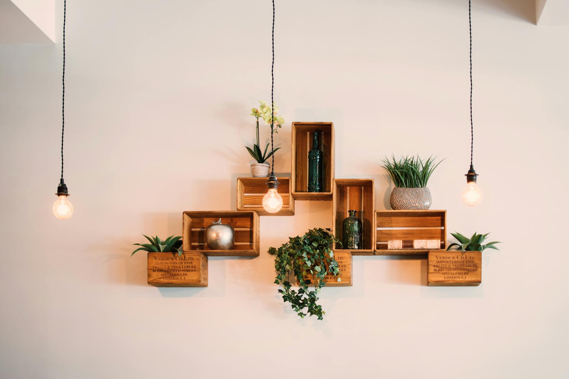
Using Plants and Flowers for Natural Pops of Color
I've found that incorporating greenery and blooms is an excellent way to add natural color. Some of my top choices include:
-
Vibrant succulents for low-maintenance color
-
Colorful orchids for elegant accents
-
Leafy ficus trees for a bold green statement
-
Seasonal flowers for ever-changing hues
Colorful Lighting Options
I'm a big fan of using lighting to subtly influence the color palette of a room. Here are some ideas I've tried:
-
Colored lampshades for a soft glow
-
RGB smart bulbs for customizable ambiance
-
Stained glass pendant lights for artistic color accents
-
Candles with colored glass holders for a warm, tinted light
Decorative Pillows and Throws
I often use textiles as an easy way to introduce color. Mixing and matching pillows and throws can create a cohesive yet vibrant look. I like to choose a main color and then add complementary shades for depth and interest.
Now that we've explored these subtle color additions, let's move on to the exciting world of color trends in home decor.
Color Trends in Home Decor
As an interior design enthusiast, I've been keeping a close eye on the latest color trends in home decor. Let me share with you some exciting insights that will help you stay on top of the game.
Current popular color combinations
I've noticed that bold and unexpected color pairings are making waves in the design world. Here's a quick rundown of some trendy combinations:
-
Navy Blue and Mustard Yellow
-
Sage Green and Terracotta
-
Blush Pink and Charcoal Gray
These combinations offer a perfect balance of depth and vibrancy, creating visually stunning spaces.
Seasonal color palette ideas
I love how colors can transform a space with the changing seasons. Here's a table showcasing my favorite seasonal palettes:
| Season | Color Palette |
|---|---|
| Spring | Pastel Yellow, Mint Green, Soft Lavender |
| Summer | Coral, Turquoise, Bright White |
| Fall | Burnt Orange, Deep Burgundy, Warm Beige |
| Winter | Icy Blue, Silver, Rich Emerald Green |
Timeless color choices for longevity
While trends come and go, I always recommend incorporating some timeless colors for a lasting appeal. My top picks include:
-
Classic White
-
Warm Neutrals (beige, taupe, gray)
-
Navy Blue
-
Forest Green
These colors serve as excellent base tones that can be easily accented with trendier hues as styles evolve.
Now that we've explored color trends, let's dive into the art of mixing and matching colors to create harmonious interiors.
Mixing and Matching Colors Like a Pro
As an interior design enthusiast, I've learned that mixing and matching colors is both an art and a science. Let me share my insights on how to create stunning color combinations in your home.
Understanding the Color Wheel
The color wheel is my go-to tool for creating harmonious color schemes. It's a visual representation of color relationships that helps me make informed decisions. Here's a quick breakdown:
| Color Type | Description | Examples |
|---|---|---|
| Primary | Base colors | Red, Blue, Yellow |
| Secondary | Mix of two primaries | Green, Orange, Purple |
| Tertiary | Mix of primary and secondary | Blue-green, Red-orange |
Complementary Color Pairings
I love using complementary colors to create bold, energetic spaces. These are colors opposite each other on the wheel:
-
Blue and Orange
-
Yellow and Purple
-
Red and Green
Creating Contrast with Analogous Colors
For a more subtle approach, I use analogous colors - those next to each other on the wheel. They create a harmonious feel with just enough contrast:
-
Blue, Blue-green, Green
-
Red, Red-orange, Orange
-
Yellow, Yellow-green, Green
Monochromatic Schemes for Sophistication
When I want to achieve a sophisticated look, I opt for monochromatic schemes. This involves using different shades and tints of the same color. It's elegant and easy to pull off.
Balancing Warm and Cool Tones
To create a well-rounded space, I always consider the balance of warm and cool tones. Warm colors (reds, oranges, yellows) add coziness, while cool colors (blues, greens, purples) bring calm. Mixing both creates a dynamic, inviting atmosphere.
Now that we've explored color mixing techniques, let's move on to applying these principles in different rooms of your home.

0 Comments